

Deliverables
Spec
User Flows
Working Prototype
Role
Product Thinking
Strategy
Design
Context
Q4 2023
Learning R&D Area
Path Team
Problem Space
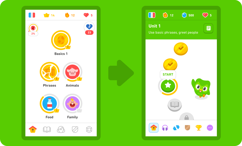
Duolingo's recent update to the learning path introduced significant changes to the product. The redesigned home screen now featured a path that learners follow sequentially. However, this transition resulted in the loss of a valuable feature: “cracked” skills. Previously, our learning tree visually indicated which skills had become rusty, prompting learners to revisit and strengthen these areas. While the new path integrated practice sessions, it lacked a way for learners who have completed a course to target and refresh their rusty skills without repetitively going back to the same content. This led to increased user churn.
In V1, at most <1.5% of our DAUs had skills they would go back to and “repair,” so we were pretty motivated to fix this issue in V2.
Duolingo’s Path Redesign
Ideation
We wanted to introduce a feature that provides course finishers with refreshing content to review every day. The goal was clear: to ensure learners never run out of content. But one of the big considerations here was how we could make this experience look and feel different, yet a continuation of our learning path. So, different, but still the same. Now that’s tricky, yeah? The other consideration was motivation. We learned from UXR that course finishers have very different language learning goals than new learners who are already quite motivated by our gamified mechanics such as the streak.
And so a lot of my initial thinking was around three themes: layout, motivation, and content. Before sketching out ideas with my PM partner, I started out by leading a brainstorm with my design and UXR partners to get some more insight into these themes.

Brainstorming “infinite content” with UXR and Design
This really helped me give some dimension to my thinking. A few major themes emerged out of our initial brainstorms:
Layout: HMW repurpose components from our path but make them not linear and allow learners to progress however they want?
Motivation: HMW make learners feel like they’re missing out if they don’t come back everyday without relying on streak?
Content: HMW make the learning content feel new, exciting, and delightful without having to make net-new course content?
With these in mind, I started sketching out some ideas in low fidelity with my PM so other stakeholders don't get bogged down by the design details and can focus on the high-level idea. We shared this with area leads in the learning area office hours to see if there was one of these ideas that we should lean more into.

Early stage concepts for Daily Refresh
Following up with feedback from area leads, some other parameters emerged:
Refresh timeline: E.g. refresh daily, weekly… or set a milestone for learners to reach which would trigger a refresh
Entry point: E.g. sections screen directly, additional path section, practice hub (paid learners only)
Progress: E.g. gems or stats as reward, so the refreshing content still feels like progress
Generally, for the MVP, we got signal to invest more into a path that wasn’t linear but used the same visual language as the current path. We also got signal to allow learners to choose the order in which they complete this practice session.
Developing the idea
I started thinking about existing experiences that offer something new and refreshing each day while also demonstrating progress. I was inspired by Apple’s Exercise rings and thought—what if we designed a circular learning path for this experience? My PM was into it, and we decided to bring it to an Alignment PR.
With our current constraints and this layout approach, we needed to consider several aspects:
Progress: How can we visually communicate daily learner progress and the refresh mechanism?
Choice: How can we guide learners in making informed choices about where to begin? What should the initial view entail?
Delight: How can we make completing this experience feel celebratory and satisfying?

Layout inspiration
I started leaning into the circular layout and exploring how this could work for our nodes. I tried out various ideas as I explored progress, choice, and delight.

Experimenting with layout and color
My initial explorations revealed several insights. One key discovery was the challenge of using our diverse color palette intentionally, given its extensive use throughout the app. We found that using multiple colors simultaneously led to confusion and dilution of meaning. Consequently, I opted to focus on a single color—our signature Owl Green.

Duolingo’s Color Palette
Our learners strongly associate Owl Green with our brand, making it a natural choice for a feature they would potentially interact with daily. For my next explorations, I focused on integrating this color into the experience.

Explorations for displaying progress
Alignment Product Review
We presented this approach in another Alignment PR, where it was extremely well-received—CEO Luis von Ahn was notably a big fan.

Product review notes
Although the layout was well-received, we encountered issues with the nodes and progress. PR feedback suggested that allowing learners too much freedom in where to start might be overwhelming, and we needed to revisit this. Additionally, using Owl Green for both active and completed nodes caused confusion, as there was no distinction between the states. It was visually very busy. We avoided using Bee Yellow for gilding, since we reserved it for content completed in hard mode, and in this use case that would have been misleading. Senior leadership also wasn’t a fan of the progress bar or rings, since both felt very explicit and against Duolingo’s ethos of intuitive design. I continued to refine my approach based on this feedback.
Addressing PR feedback
After the PR, we chose to keep the circular layout but adopted a linear, clockwise progression instead of allowing learners to select where to start. Which mean active nodes would be different from locked nodes. This addressed some color differentiation issues, making progress feel more intuitive. However, the challenge of clearly communicating the reset mechanism remained. At this stage, we also took our explorations to Rolling Research and got feedback that most course completers weren’t a fan of unlocking a chest to reveal rewards such as streak and gems, so we decided against including it for the MVP. They simply wanted more content to practice. I explored the circular layout with more practice nodes and different ways to communicate the reset mechanism.

Explorations to surface learner progress

I also collaborated with our Content Designers to refine the copy, a crucial tool for communication. We ultimately transitioned from calling the experience “Daily Review” to “Daily Refresh.” Senior leadership was a fan of this name too—it helped clarify the mechanic. However, the timer seemed to suggest how long it would take learners to complete this session, so we decided to remove it. And since we were now going to have active nodes distinct from locked ones, we decided not to include a node count. The tooltip idea felt celebratory, but it went against our principle of making the experience self-explanatory. Now felt like a good time to collaborate with our talented team of Studio Designers to bring delight and satisfaction to the completion experience without relying on text!
In terms of branding, after discussing with my engineering partners, I received feedback that introducing rotating world characters would add code complexity. So for the MVP, we decided to stick with just Duo.
Wrapping things up
Collaborating with Studio, we felt confident about the various states. For the session complete animation, we animated Duo performing a lively pom-pom dance, which was incredibly fun. This helped communicate completion and progress within the context of Daily Refresh. I then worked closely with the Learning and Curriculum team to finalize the logic for the content we would surface. We got the MVP spec approved in product review and started running the experiment.

Final MVP design
Impact and real quotes
Daily Refresh was an immediate success, significantly boosting our core metrics right after the initial rollout and as we rolled out to 100%. Within the first two weeks, we saw numerous Reddit posts from learners expressing excitement about the new feature, and power users eagerly anticipating reaching this point in their learning journey on the app.
“Finally an option to revise old material without having Duolingo Plus”
“Oh this is great! I’ve finished the Chinese course and moved onto other materials but I do one random lesson a day, and this would be a nice replacement!”
“Thank you Duolingo! This is such a good addition, more options is always better. I was getting rusty”
We observed a spike in key metrics like Time Spent Learning (TSL) and a lower churn rate. Not only did retention increase, but, surprisingly, DAUs also went up.

Future of Daily Refresh
At Duolingo, one of our operating principals is “taking the long view.” We want to make decisions that keep us moving toward our big goals. While our initial experiment was a big success, Daily Refresh wasn’t perfect just yet. We moved fast to get the MVP out which we did, but we wanted to keep making it better. Over the next few months, I took the lead on addressing any reports or feedback that would come our way while also exploring the future of Daily Refresh.
Refresh Mechanism
Something we hadn’t still nailed yet was communicating the refresh mechanism to learners. We were getting reports from learners that they were “losing progress.” We discovered that most learners don't complete the entire section (6 nodes) in a day, so they rarely see the completion animation. Instead, they would return the next day to a new set of content and believe their previous progress was lost.

To address this, we enhanced our approach with more animation. I designed an animation that triggers when the learner first opens the app, where nodes trickle in to highlight the new content generated for them. We also started displaying today's date in the Daily Refresh section to clearly indicate that the content updates daily. In the animation, the date in the header changes as the nodes animate in, reinforcing the refresh. In this time, our unit headers had also gotten an update which helped us make the most of this animation.
Course Completion and Branding
We considered its role in the broader context of course completion. I focused on branding the entire experience and mapping the learner's journey from completing a course to onboarding onto Daily Refresh. Previously, course completion lacked celebration, and the transition to Daily Refresh was abrupt. This was a good opportunity to also better the user education about the experience.

Daily Refresh in the context of course completion
Personalization and Monetization
To keep Duolingo accessible to learners worldwide, we don’t (and never will) charge for learning content. But we’re always thinking about how learners can get more out of the content they’re learning. In Q2 2024, I organized a brainstorm with our Monetization team to think about how we can collaborate on this and take Daily Refresh to the next level. Specifically, we explored at personalization and giving the learner control over what type of content they want to practice.

Explorations for monetizing and personalizing Daily Refresh
And while it is still early on, I’m extremely excited about this collaboration in Q3 and to see how we can make Daily Refresh better than ever.