
Team(s)
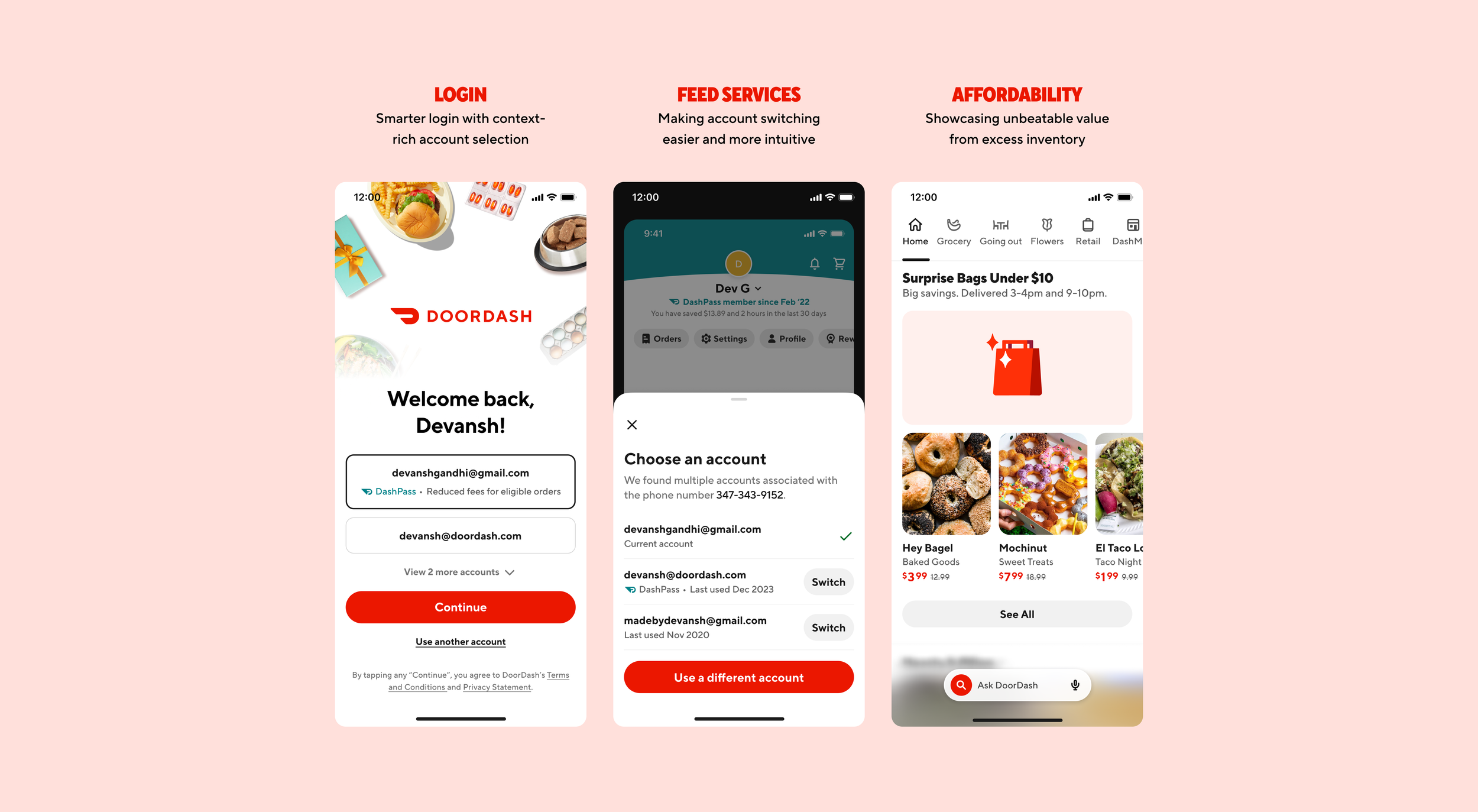
Login
Affordability
My Role
Product Strategy
Design
Contract Overview
Growth Area
H1 2025 (6-month contract)
Overview
During my time on the Growth team at DoorDash, I worked across login, authentication, and affordability to improve key parts of the customer experience. These projects weren’t large-scale redesigns — they were fast, high-impact optimizations aimed at reducing friction, increasing trust, and unlocking value for both users and merchants. From smarter account switching to surfacing affordable deals, each initiative focused on clear hypotheses, efficient execution, and measurable outcomes. Below is a collection of those improvements, designed and shipped over a 6-month contract.
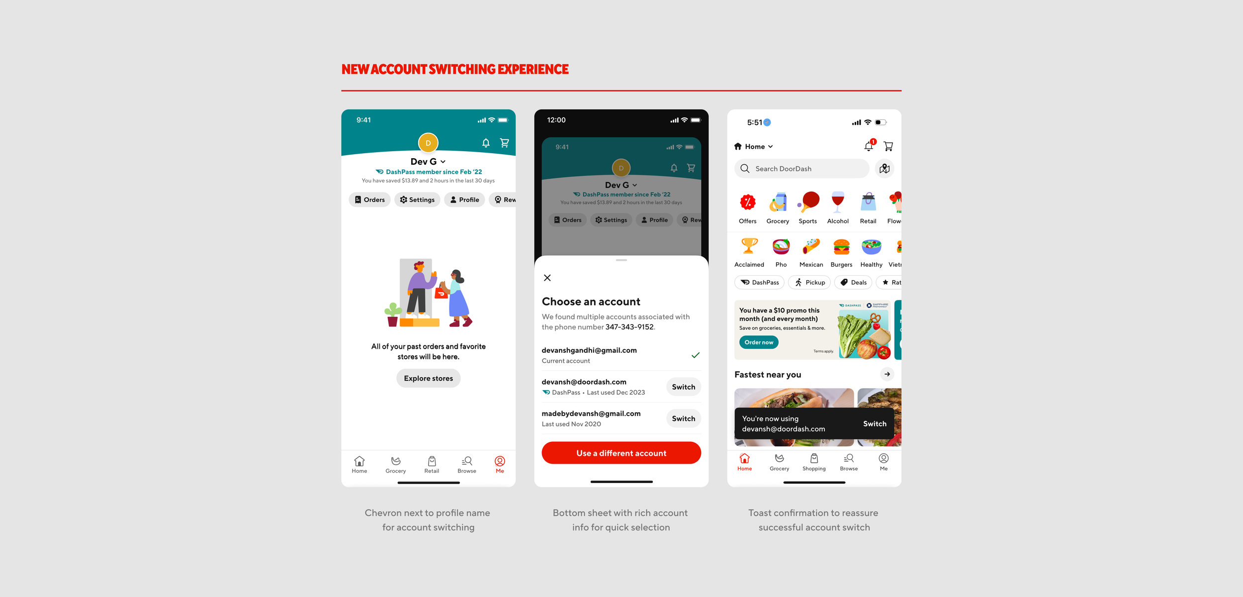
Account Switching
Problem
DoorDash’s "Switch Account" feature, launched the previous year, allowed users to toggle between accounts without logging out. But despite its value, the entry point was largely undiscoverable — hidden 3+ taps deep under Settings. As a result, over 200,000 iOS users per month continued logging out entirely.
Solution
After exploring multiple directions with the Feed and DashPass teams, I redesigned the entry point to live directly in the profile header as a down chevron next to the profile name. This placement felt intuitive and reduced the switch account interaction to a single tap, while minimizing disruption to high-traffic elements like Orders and still aligning with existing design patterns.
Impact
The improved entry point is expected to drive an +51K MAUs, $57M in annualized GOV, and reduce 832,000 logouts per year.
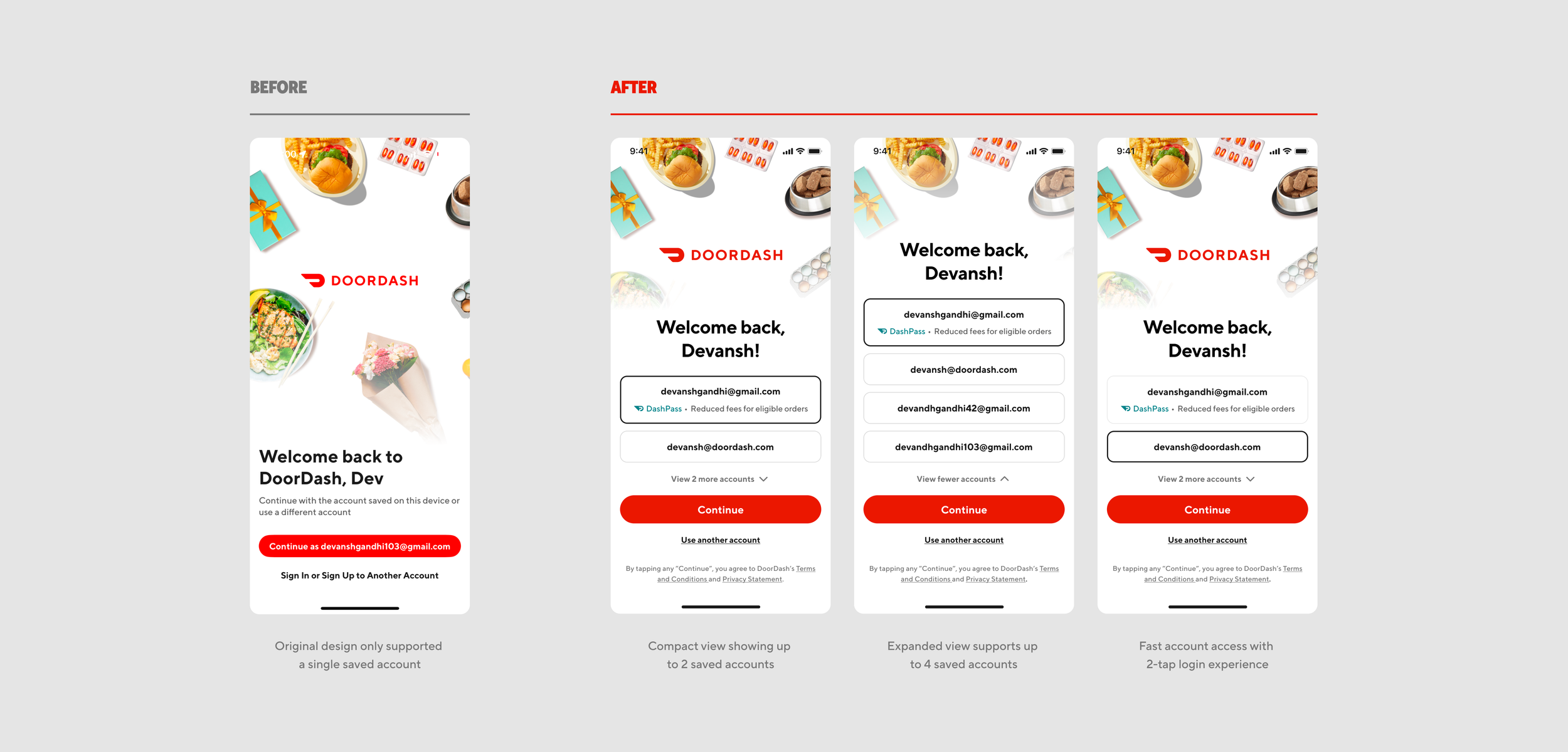
Multiple Account Login
Problem
Roughly 50% of DoorDash users have multiple accounts, but our original "Save Login Info" feature only supported one saved account. This led to friction during re-login, and many users continued to log out and back in manually, creating unnecessary churn and extra steps.
Solution
I redesigned the login experience to display multiple saved accounts, each with helpful context like DashPass eligibility, available credits, or last activity. A “recommended” account is preselected to guide users toward the most seamless and cost-effective option.
Expected Impact
This redesign is expected to improve login completion rates, reduce unnecessary logouts, and drive incremental increases in MAU and GOV by surfacing higher-value, more active accounts.
Optimal Login
Problem
Our previous “Last Login” feature defaulted to showing users their most recently used login method. While this worked for single-account users, it often surfaced less relevant accounts for users with multiple profiles — missing opportunities to improve recommendations, fulfillment success, and user retention.
Solution
I redesigned the experience as “Optimal Login”, where users are nudged toward accounts tied to DashPass (for free delivery and affordability) or those used most frequently (for better recommendations and stored info like payment and address). This approach helps guide users to the account that offers the smoothest and most valuable experience.
Impact
The new redesign is expected to drive +163K MAU and generate $130.1M in GOV by improving login relevance and reducing drop-off during re-authentication.

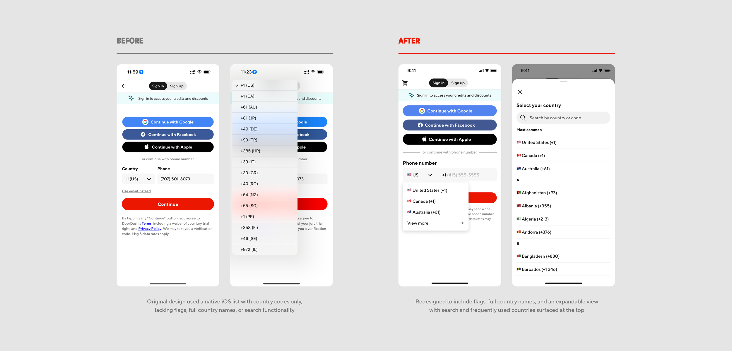
International Phone Sign-Up
Problem
Our sign-up flow currently supports ~20 countries, but the existing country code picker is built using a native iOS component that lists only codes and country initials. This UI isn't scalable or user-friendly enough to support additional countries — limiting our global expansion and degrading the user experience for international customers.
Solution
I redesigned the UI to be more flexible and intuitive. The new component shows flags and full country names, displays frequently used countries at the top, and includes a searchable expanded view for fast access. This creates a much more scalable and accessible experience as we work toward supporting all countries.
Expected Impact
The redesign is expected to drive increased sign-ups by reducing friction for international users, improving clarity during phone number entry, and shortening time to complete sign-up. It also lays the foundation for future scalability as we expand support to more countries.
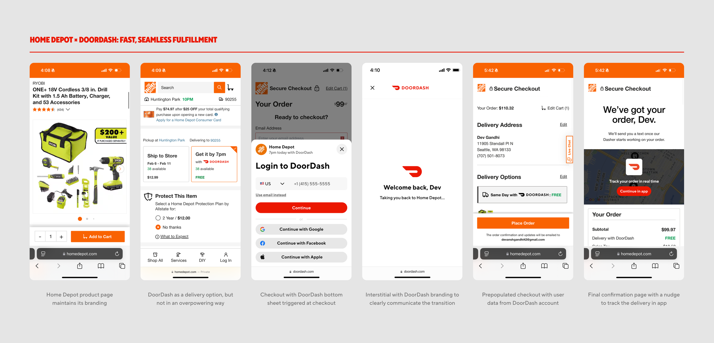
Login as a Service
Problem
DoorDash customer accounts hold rich data — delivery address, payment method, and more — but this value is currently siloed within the DoorDash app and site. External partners (like retailers or third-party merchants) must build custom integrations to unlock features like instant delivery or DashPass benefits, resulting in a fragmented, inconsistent experience.
Solution
As part of a broader initiative to productize DoorDash login, I designed a conceptual flow for how external partners like Home Depot could embed DoorDash services into their own experiences. The end-to-end design maintains the partner’s brand while introducing lightweight, intuitive moments for users to log in with DoorDash, access saved account details, check out in one tap, and unlock benefits like 1-hour delivery for eligible items.
Outcome
This work was shared with cross-functional leadership as a vision for external partnerships and a foundation for scaling DoorDash’s identity and logistics capabilities into third-party experiences.
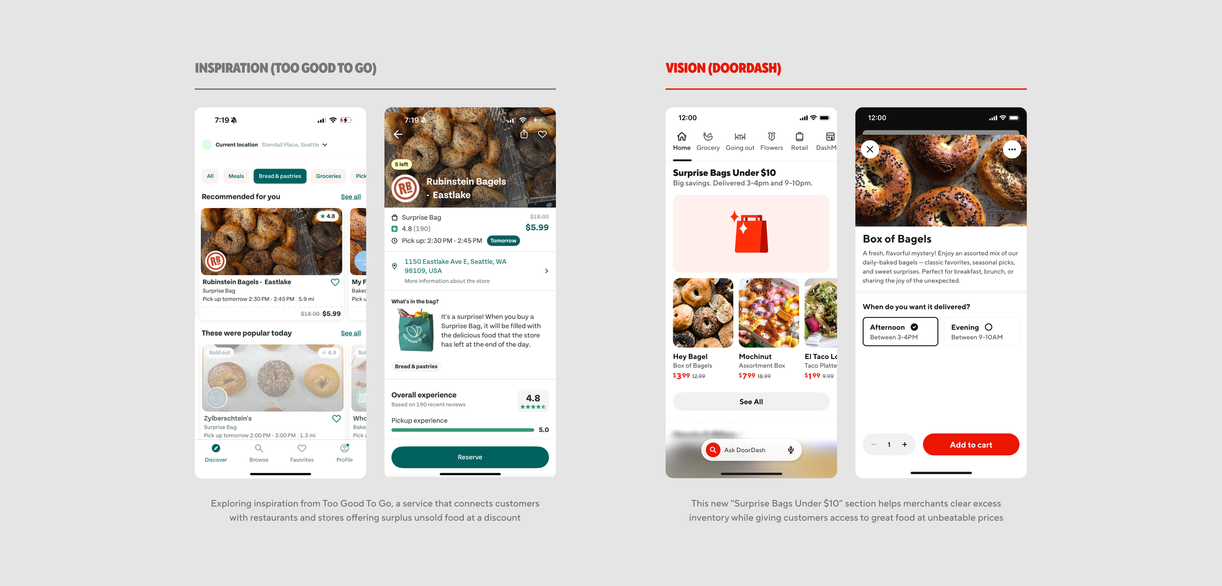
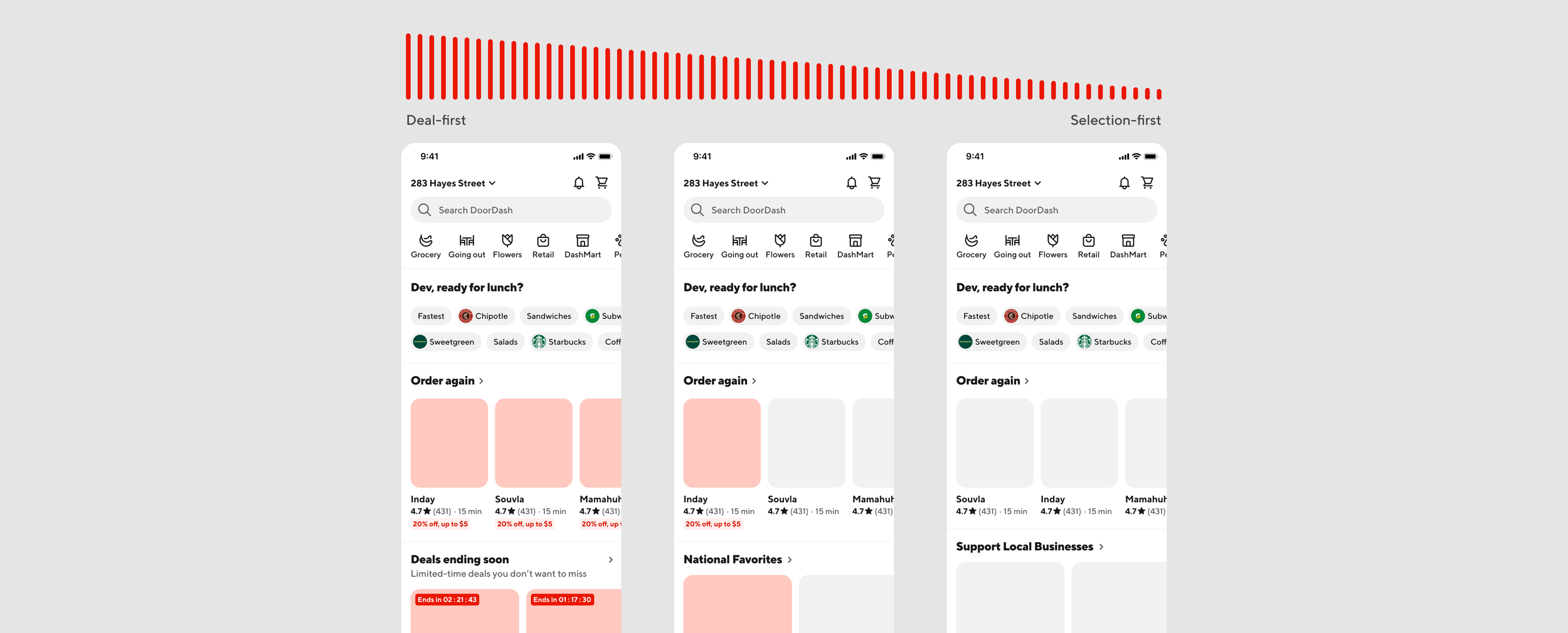
Affordability: Surprise Bags & Dynamic Discovery
Problem
DoorDash has limited offerings tailored to price-sensitive customers, and many merchants struggled with excess inventory that often went unsold. This gap left value-conscious users underserved, while also resulting in food waste and lost revenue for merchants.
Solution
While supporting the Affordability team, I explored two vision concepts aimed at improving affordability and retention:
Surprise Bags Under $10: Inspired by Too Good To Go, this concept repackages surplus inventory into low-cost, high-value meals. It provides merchants a new way to recover revenue while offering customers an affordable and exciting experience.
Dynamic Discovery: A feed evolution model that starts deal-first for new or lapsed users — helping reduce churn — and gradually shifts toward selection-first as trust builds. This approach helps balance affordability and variety based on user behavior over time.
Expected Impact
These concepts were presented to senior leadership as part of a broader affordability strategy, with the goal of informing future product directions. If implemented, they’re expected to increase GOV and MAU by improving perceived value, reducing food waste, and tailoring the DoorDash experience to better meet the needs of price-sensitive users.
Learnings
Working across both the Login and Affordability spaces at DoorDash gave me a front-row seat to the impact of small, focused product decisions at scale. I learned how to design within fast-paced, high-growth environments, where even subtle changes to entry points, flows, or messaging can move millions in GOV.
I also saw the power of designing for flexibility — whether that meant supporting multiple accounts, evolving user behavior over time, or scaling identity across external platforms. Most importantly, I learned how to communicate design not just as UI, but as product and platform thinking — especially when presenting vision work to leadership.